Most buyers think color temperature is a small detail, but It is not.
You can choose the right strip, the right voltage, and the right installation method — and the space can still feel wrong if the white tone is wrong.
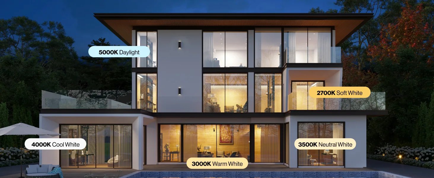
That is why 3000K vs 4000K vs 5000K vs 6000K matters more than many people expect. In the reference comparison, 3000K is framed as warm and relaxing, 4000K as more neutral, and 5000K to 6000K as cooler, brighter daylight-style whites.
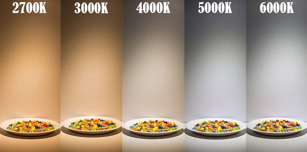
Table of Contents
- What color temperature actually means?
- 3000K: warm and comfortable
- 4000K: clean and balanced
- 5000K: bright and task-focused
- 6000K: crisp and cool
- 3000K vs 4000K vs 5000K vs 6000K: quick comparison
- Which color temperature is best for each space?
- When not to choose a fixed CCT?
- Final takeaway
What color temperature actually means?
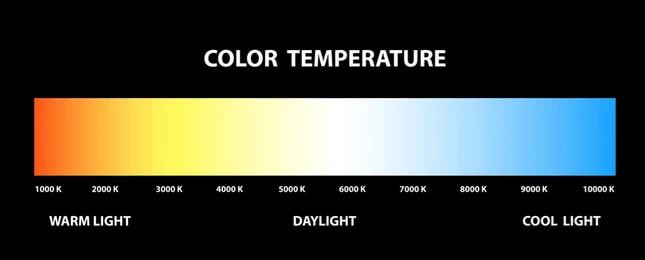
Color temperature, or CCT, describes how warm or cool white light looks. Lower Kelvin values look warmer and softer. Higher Kelvin values look cooler and sharper. In this comparison range, 3000K sits in warm white, 4000K in neutral white, and 5000K to 6000K in cool or daylight-style white.
This matters because people do not react to light by brightness alone. They react to mood, contrast, surface appearance, and comfort. A room lit at 3000K usually feels calmer. The same room at 5000K often feels clearer and more active, but also less relaxed. That is why color temperature should be chosen by scene, not by habit.
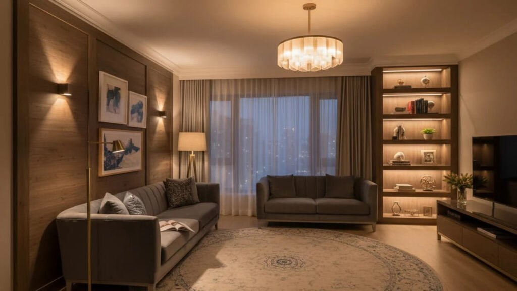
3000K: warm and comfortable
3000K is usually the safest choice when the goal is comfort.
It gives off a warm white tone that feels more inviting than neutral or daylight-white options. The reference article places 3000K in bedrooms and living rooms because it creates a cozy, relaxing atmosphere. Related comparisons from the same source family also describe 3000K as cleaner and less yellow than 2700K, which is one reason it works well when you want warmth without making the space feel too amber.
Best for
- living rooms
- bedrooms
- hotels
- restaurant ambience
- residential coves
- decorative shelving
- hospitality lighting
Why buyers choose it
- it feels warmer and softer
- it works well in evening-oriented spaces
- it flatters wood, warm finishes, and softer interiors
- it usually feels more comfortable in residential settings
Where it can be the wrong choice
3000K is not always the best fit for task-heavy spaces. In some kitchens, offices, worktops, and utility areas, it can feel too soft if the project needs a crisper visual effect.
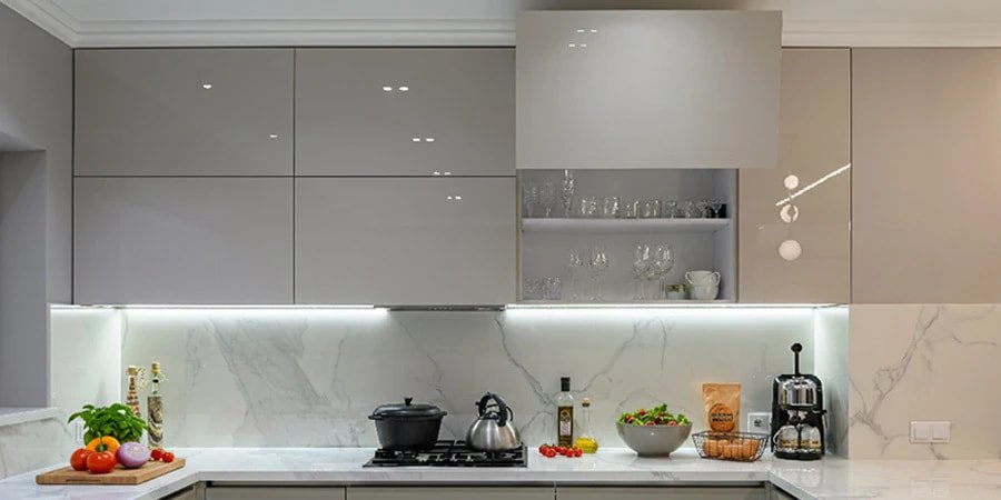
4000K: clean and balanced
4000K sits in the middle.
It is often the easiest fixed color temperature when one space needs to do more than one job. It feels cleaner than 3000K, but not as cold as 5000K or 6000K. Recent guides describe 3000K and 4000K as the transition from warm white to neutral white, and place 4000K as the more balanced option for general spaces.
Best for
- kitchens
- bathrooms
- offices
- retail
- circulation areas
- wardrobes
- mixed-use commercial spaces
Why buyers choose it
- it looks clean without feeling too clinical
- it supports both ambient and task lighting
- it is more flexible than 3000K in functional spaces
- it works well when one area has mixed use
Where it can be the wrong choice
If the project is strongly mood-led, 4000K can feel a little flat compared with 3000K. In high-comfort residential spaces, some clients see it as safe and practical, but not especially warm.
5000K: bright and task-focused
5000K moves clearly into daylight-style white.
This is where the light starts to feel brighter, sharper, and more alert. 4000K vs 5000K comparison positions 5000K as the stronger fit for kitchens, offices, and other task-oriented spaces where contrast and clarity matter more. Their broader color temperature guide also treats 5000K as a point where function starts to matter more than atmosphere.
Best for
- task lighting
- workshops
- offices
- utility rooms
- garages
- some commercial displays
- areas where clarity matters more than warmth
Why buyers choose it
- it looks brighter and crisper
- it supports focus and task visibility
- it helps surfaces and details stand out
- it often feels more practical in functional spaces
Where it can be the wrong choice
5000K can feel too cool in lounges, bedrooms, restaurants, or hospitality interiors where comfort comes first. It is usually better for doing than for relaxing.
6000K: crisp and cool
6000K is the coolest option in this group.
It pushes further into cool daylight territory and usually feels the most clinical, sharp, and high-contrast. In the comparison family, 5000K and 6000K are both treated as cool/daylight whites, with 6000K being the colder end of that range.
Best for
- high-contrast task areas
- some security or utility lighting
- certain industrial or back-of-house areas
- spaces where atmosphere matters less than visual sharpness
Why buyers choose it
- it feels very crisp
- it creates a colder, cleaner visual effect
- it can suit technical or industrial environments
Where it can be the wrong choice
In many interior spaces, 6000K feels too cold. It can make hospitality, residential, and premium architectural spaces feel less comfortable and less refined. For most indoor decorative projects, it is usually not the first choice.
3000K vs 4000K vs 5000K vs 6000K: quick comparison

3000K
Warm white
Best for comfort, mood, and residential atmosphere
4000K
Neutral white
Best for balance between comfort and function
5000K
Cooler daylight white
Best for task clarity and brighter contrast
6000K
Very cool white
Best for technical or highly functional spaces where atmosphere matters less
If you want the shortest rule of thumb:
- choose 3000K when you want the space to feel comfortable
- choose 4000K when you want the space to feel clean and versatile
- choose 5000K when you want the space to feel bright and task-focused
- choose 6000K when you want the space to feel very cool and highly functional
That summary is consistent with the reference comparison and wider 2700K–6500K color temperature guides.
Which color temperature is best for each space?
Living room
Usually 3000K
Warmer light generally feels more natural and comfortable here.
Bedroom
Usually 3000K
Better for softer, more relaxing evening scenes.
Kitchen
Usually 4000K or 5000K
4000K works well for mixed use. 5000K suits more task-heavy kitchens.
Bathroom
Usually 4000K
Neutral white is often the safest balance between comfort and clarity.
Office
Usually 4000K or 5000K
4000K is more balanced. 5000K is more alert and task-oriented.
Retail
Depends on the product and brand mood
3000K can flatter warm materials and hospitality-style retail. 4000K is a stronger all-rounder. 5000K may work where contrast and product clarity matter more.
Hotel
Usually 3000K
Warmer light supports comfort and atmosphere. Tunable white can be even better where day and night scenes both matter. Xmart’s tunable white page presents adjustable white light on one strip, and its dim-to-warm page positions warmer dimming curves for hospitality and mood-focused lighting.
Garage, workshop, utility area
Usually 4000K or 5000K, sometimes 6000K
These spaces usually benefit from cleaner, more functional light.

When not to choose a fixed CCT
Sometimes the real answer is not 3000K, 4000K, 5000K, or 6000K.
It is tunable white.
If one project needs warm ambience at night and cleaner task light during the day, a fixed CCT becomes a compromise. That is exactly where tunable white or dim to warm makes more sense. Xmart’s tunable white strip page presents smooth transition between warm white and cool white on one strip. Its dim-to-warm page presents a warm shift from 3000K down to 1800K as brightness is reduced.
Xmart’s COB page also positions tunable white COB as a dotless adjustable-white solution for hospitality, residential, and display environments.
Choose tunable white when
- one space has multiple moods
- day and night scenes are different
- the client is sensitive to ambience
- the project is hospitality, wellness, or premium residential
Choose dim to warm when
- the goal is a more intimate evening feel
- the client likes incandescent-style dimming behavior
- the project is mood-led rather than task-led
Final takeaway
There is no single best color temperature.
There is only the right one for the space.
If the goal is warmth, comfort, and atmosphere, 3000K is usually the strongest choice. If the goal is balance, 4000K is often the safest. If the goal is clarity and task support, 5000K is usually stronger. If the goal is a very cool, crisp, technical look, 6000K may be the right fit. That overall logic matches both the reference comparison article and Xmart’s broader white-light product structure across single-color, tunable white, dim-to-warm, and CSP options.
The biggest mistake is choosing by habit. Choose by scene instead.
Not sure whether 3000K, 4000K, 5000K, or 6000K fits your project? Send us your application, mounting method, and target lighting effect. We can help you match the right color temperature, strip structure, and control option before the wrong white tone turns into a site problem.